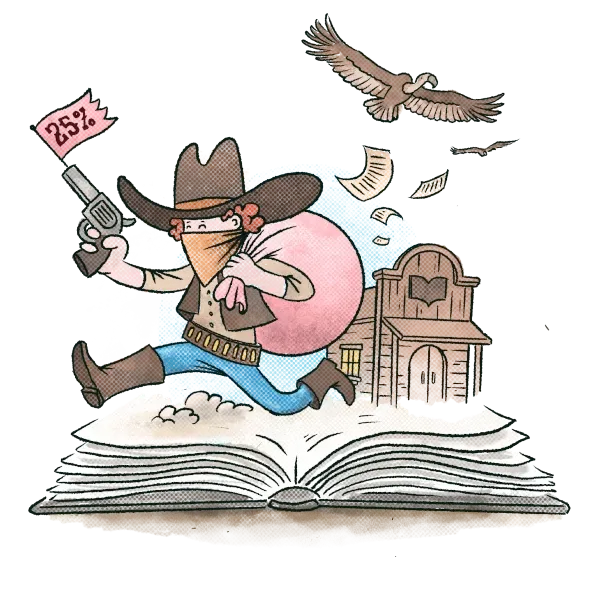
It’s easy to say, “don’t judge a book by its cover,” and while the advice may be sound, it’s not how reader psychology works.
In reality, an engaging cover will be a reader’s first impression. No matter how good your words are, a boring or bad quality cover will deter your readers.
Here are the five most common book cover blunders that are made by new authors.
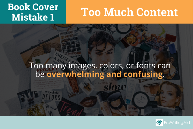
Book Cover Mistake 1: Too Much Content
When designing a great book cover, less is often more. Too many images, colors, or fonts can be visually overwhelming.
Using too many images can give away plot elements and confuse potential readers.
A single, well-chosen, cohesive image is better than a collage of poorly chosen pictures. It can provide context and give your readers a visual cue for what they can expect from your narrative.
The same goes for colors and fonts. Never use more than two fonts or too many conflicting colors in a single design.
There are many free design theory resources available online, so it’s worth investing some time into developing a basic understanding of colors and fonts before designing your own book cover.
Typography, color, and layout choices say a lot about what a reader can expect from your book.
You want colors that fit the genre and complement each other; the same goes for typefaces. Additionally, you should ensure the fonts are easy to read and will be legible on the thumbnails of eReaders.
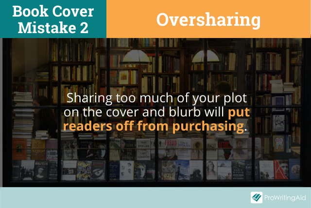
Book Cover Mistake 2: Oversharing
After putting your blood, sweat, and tears into your writing, it can be easy to want to share what makes your story unique. Many new writers make the mistake of telling readers everything about their book through the cover design or blurb.
If a reader already knows everything about your book, then there is no reason to read it.
By oversharing on your cover, you’re essentially removing the spoiler tags from your work, and any reason a reader may have had to open your book.
Another trap that many new writers fall into is to use their covers to make a point.
In fiction writing, this is often irrelevant to the story and serves as a distraction. For non-fiction authors, this usually happens because they want to share the central argument of their work.
Your book cover is not there to make a case for the validity of your argument. Don’t give away your central premise too easily—sometimes it’s good for a reader to work for it.
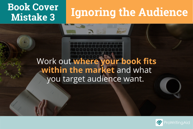
Book Cover Mistake 3: Not Considering Your Audience
Just because you like something doesn’t mean your audience will. You may have a particular aesthetic that speaks to you, but you need to make sure that aesthetic will also speak to your readers.
Market research is key to finding out where your book fits into the market. It’s important to know who your readers are and what visual cues they may expect from your book cover.
Readers form their expectations on visual impressions, so it’s essential to consider those expectations when designing your cover art.
You should try to avoid people in your cover because fashion, hairstyle, and age choices can often deter a reader if they don’t mesh with their expectations.
Not only can it make an author seem out of touch (a middle-aged writer creating juvenile-looking characters for their YA fiction, for example), but it can also quickly date the design.
Including current fashions in a novel about a dystopian future would not give your readers the right impression.
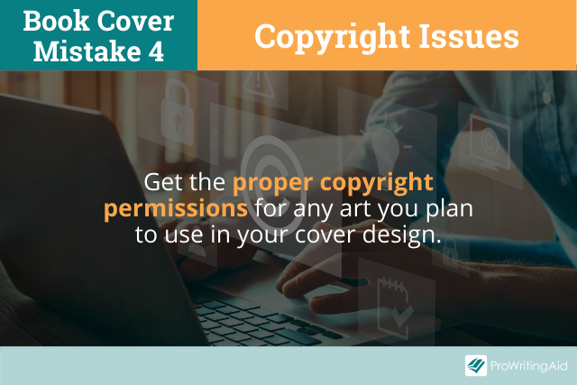
Book Cover Mistake 4: Copyright Issues
Artists deserve to be paid for their work, just like writers. It’s essential to get the proper copyright permissions for any art you plan to use in your cover design.
It is easy to forget that there is a designer behind every image on the internet, and that many of them fall under copyright.
Copyrighted images will usually need a commercial licence if you’re planning on selling your book, which can get very pricey. So, it’s vital that you include any copyright permissions in your cover art budget.
If you don’t get the proper permission, you leave yourself open to lawsuits or takedown notices that can be expensive, affect your credibility, and harm your online standing.
To avoid copyright issues, some writers commission artists to create lookalikes. This is especially common when copyright licensing is too expensive or has been refused.
While this technically gets around the issue, having someone copy another artist’s intellectual property is ethically questionable and the resulting artwork is rarely the same quality as the original.
Having a poor imitation of a popular artwork on your book cover will leave a bad impression on your readers, so generally it’s best avoided.
Book Cover Mistake 5: Not Considering the Genre
You need to know your audience but above all, you need to know your genre. A book cover that doesn’t appropriately reflect the genre might not stop people from purchasing, but it will affect how people review it.
When a reader picks up a book, the cover is the first thing they see, and they form an expectation based on that.
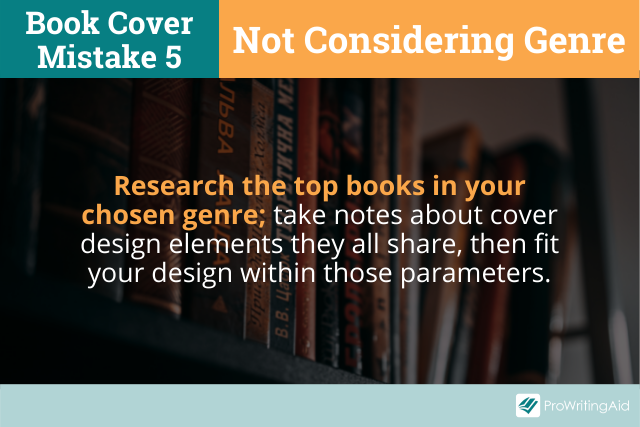
Research the top books in your chosen genre and take notes about cover design elements they all share, then fit your design within those parameters.
If you’re writing a cosy romance, there’s no point creating a dark cover that looks mysterious. You need your design to convey the mood and tone of your words.
How Do You Make a Good Book Cover?
If you’re unsure about your cover art, the best thing to do is to get feedback from beta readers or people who don’t know what you’re writing.
Show them your design, ask them what images it conjures, and what genre they think the book falls into. If their feedback doesn’t fit what you expected, go back to the drawing board.
If your book doesn’t conform to reader expectations of genre, your target audience will pass it over as they won’t think it’s for them.
For instance, a romance reader might not be a fan of horror novels, so if your historical romance has a dark spooky cover, you’ll lose readers before they’ve reached the blurb.
Final Thoughts
By avoiding these five common cover design mistakes, you’ll make your book much more marketable. You’ll not only have a cover that’s much more visually appealing, but you’ll also manage reader perceptions and expectations.
You owe it to yourself and your writing to have a cover that is great, not just good.
Should I go with traditional, indie, or hybrid publishing? Download this free book now:
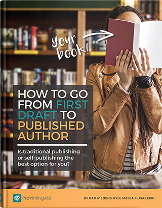
How to Go From First Draft to Published Author
How do I write a pitch? What kind of royalties should I expect? What the heck are beta readers and why do I need them?
This guide will take you through the entire process, from refining your manuscript to choosing a publishing track to releasing your book into the world.

Be confident about grammar
Check every email, essay, or story for grammar mistakes. Fix them before you press send.